SAS: Histograms
By creating a histogram, users are able to create graphical displays of tabulated frequencies that show the proportion of cases in several specified categories. Histograms are only one way SAS is able to create a graphic to show the relationships between data.
To Create a Histogram:
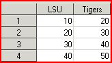
1. Open a new spread sheet and enter all relevant data. For more help see GROK article 5097.
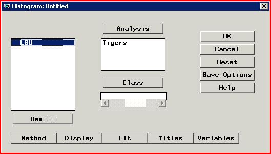
2. Next, go to Graphs and click Histogram. Then select the title from the menu and click Analysis.
3. Select the column titles to add to the histogram and click Analysis at the top.
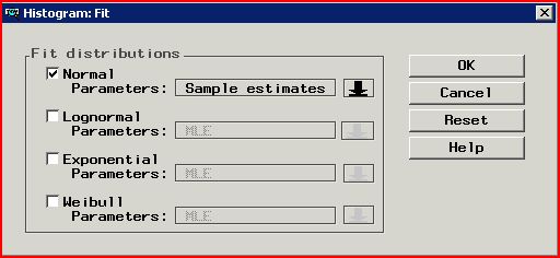
4. Next, click Fit at the bottom middle, and select Normal Parameters. Then click OK at the top right.
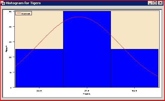
5. Click OK once more and a histogram should open.
Referenced from: Support.sas.com
5125
8/13/2025 8:39:55 AM